

Blog
The Fantastic Four
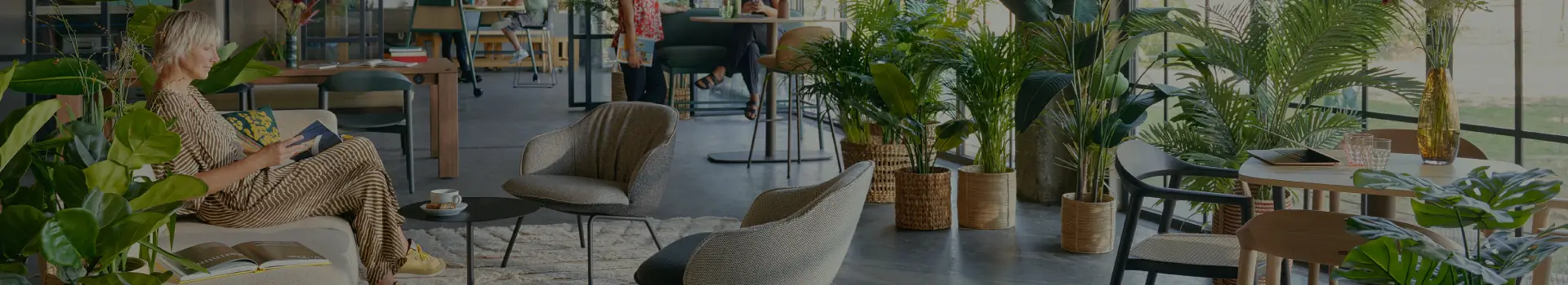
Colors influence us more than we realize. Acting like an emotional compass, certain shades can shape moods, energy, and even productivity. The four primary colors with the strongest impact are green, yellow, red, and blue. Often, colors are categorized as warm (red, orange, yellow) or cool (purple, blue, green). Each evokes unique emotions and helps create distinct atmospheres in classrooms, offices, or any interior space. Interestingly, cool colors make spaces feel larger, while warm colors make them appear cozier. Warm shades create a welcoming vibe, while cool tones bring a refreshing, calm sensation.
Did you know?
The human eye can distinguish around 10 million colors, yet we can name fewer than 40,000.
Green
Green is the color of harmony, nature, and health. Associated with youth, safety, and environmental awareness, it is the most visually soothing color. Green spaces reduce eye strain, promote balance, and create a refreshing, calming environment—perfect for any room.
Yellow
Yellow symbolizes sunshine, optimism, and energy. It captures attention, stimulates thinking, and enhances memory, making it ideal for workplaces and creative meeting rooms. Yellow encourages conversation and collaboration, making it perfect for brainstorming sessions or idea generation.
Red
Red commands attention and ignites energy, passion, and power. It stimulates the senses and even increases heart rate, making it memorable. However, it should be used sparingly, as excessive red can create tension or stress. Red is also believed to stimulate appetite, which is why it’s common in restaurants.
Blue
Blue evokes calm, focus, and serenity. It reduces stress, promotes relaxation, and improves concentration, making it ideal for meeting rooms, workshops, or spaces designed for creative thinking. Blue encourages productivity by helping people feel centered and focused.
Orange
Like red, orange draws attention, but in a warm and welcoming way. It promotes sociability, alertness, and positivity. Orange inspires conversation, making it ideal for communal spaces, kitchens, and dining areas.
Purple
Historically worn by royalty, purple conveys luxury, loyalty, and sophistication. Loved by children, it’s a versatile color that works well in educational settings, adding a touch of creativity and elegance.
Turquoise
Turquoise symbolizes freshness, purity, and vitality. Often associated with water, wellness, and healthcare, it evokes clarity and calmness, making it perfect for spa-like, rejuvenating environments.
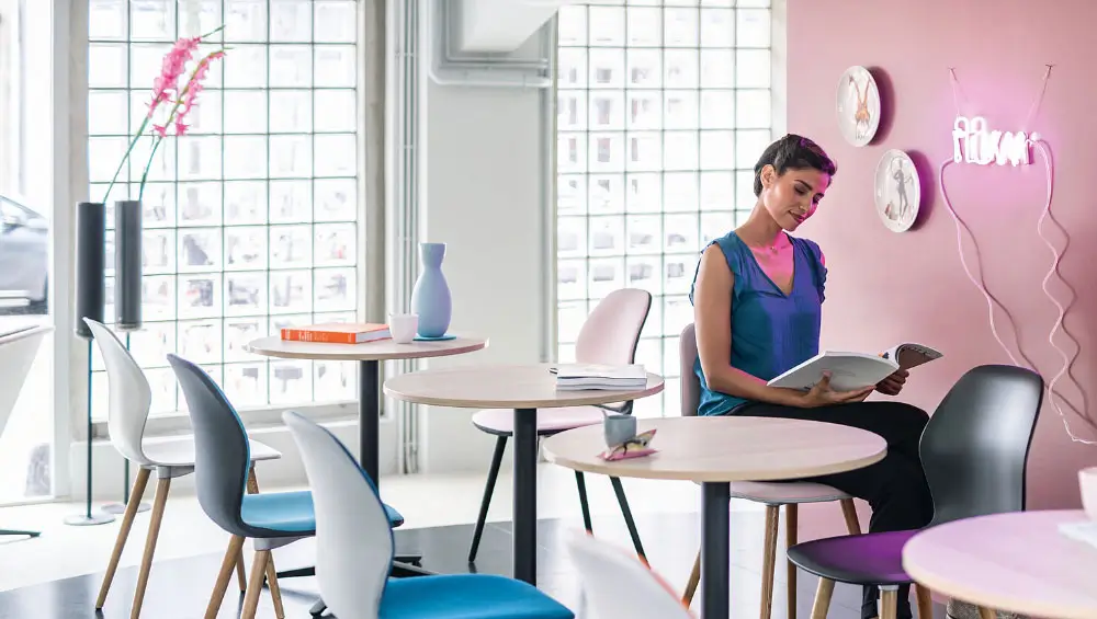
Pink
Pink is a soothing and gentle color, evoking feelings of security, joy, and optimism. Ideal for quiet spaces, it promotes calm interaction and comfort.
Brown
Brown inspires stability and safety, creating a grounded, cozy environment. Used in moderation, brown combined with beige provides a calming backdrop for relaxation or focused work. Too much, however, can feel heavy or somber, so balance it with brighter accents for energy.